Workray dashboard - 500% click-through rate increase
Workray dashboard allows people looking for work to preview all their job hunting activity in one place. The platform aggregates job related information from up to 62 job sites and company recruitment pages, allowing candidates to enter job application information themselves to manage job searching easier.
Problem
We invested time and resources on the Workray homepage to convince users to sign up to the service and increase conversion. Users felt disappointed with the dashboard after signing up because of the effort they've put into the service without getting anything in return. This resulted in a really high bounce rate with new users.
In addition returning job seekers did not use the dashboard, instead they went directly to the other areas on the site via the sidebar navigation.
EXISTING DASHBOARD - RETURNING USERS

HIGH LEVEL GOALS
1. User goals: Organise job searching experience and view job status to help get a job.
2. Business goal: Increase time on page, click-through rate and engagement on the dashboard. Retain new users.
My Role
I ran remote user testing to understand user pain points when onboarding and using the dashboard; I conducted moderated user testing to glean how job seekers managed their job search in general; I created user testing reports and fed those back to the business. On the back of the user feedback I redesigned the dashboard; and user tested the proposed new designs.
User testing
When I user tested the onboarding flows candidates were directed to the dashboard. They didn't feel there was anything to keep them on the platform.
"I just wasted my time. Gave you all this information and then I end up on a page that has a lot of zero things. Zero applications, zero jobs, zero goals."
Most users who we converted and registered on the homepage decided not to return again to the dashboard and even the platform. They didn't think it stood up to the promise of helping them organise their job search.
"There is nothing useful on this page to help me get a job"
Design
User testing told us the new dashboard needed to be completely revamped. Small improvements were not going to be enough. However, the back-end development team were busy working on another area of the platform. The changes to the dashboard had to be mostly front-end, reusing existing functionality from other areas of the site without compromising the user needs.
NEW DASHBOARD DESIGNS - RETURNING USERS
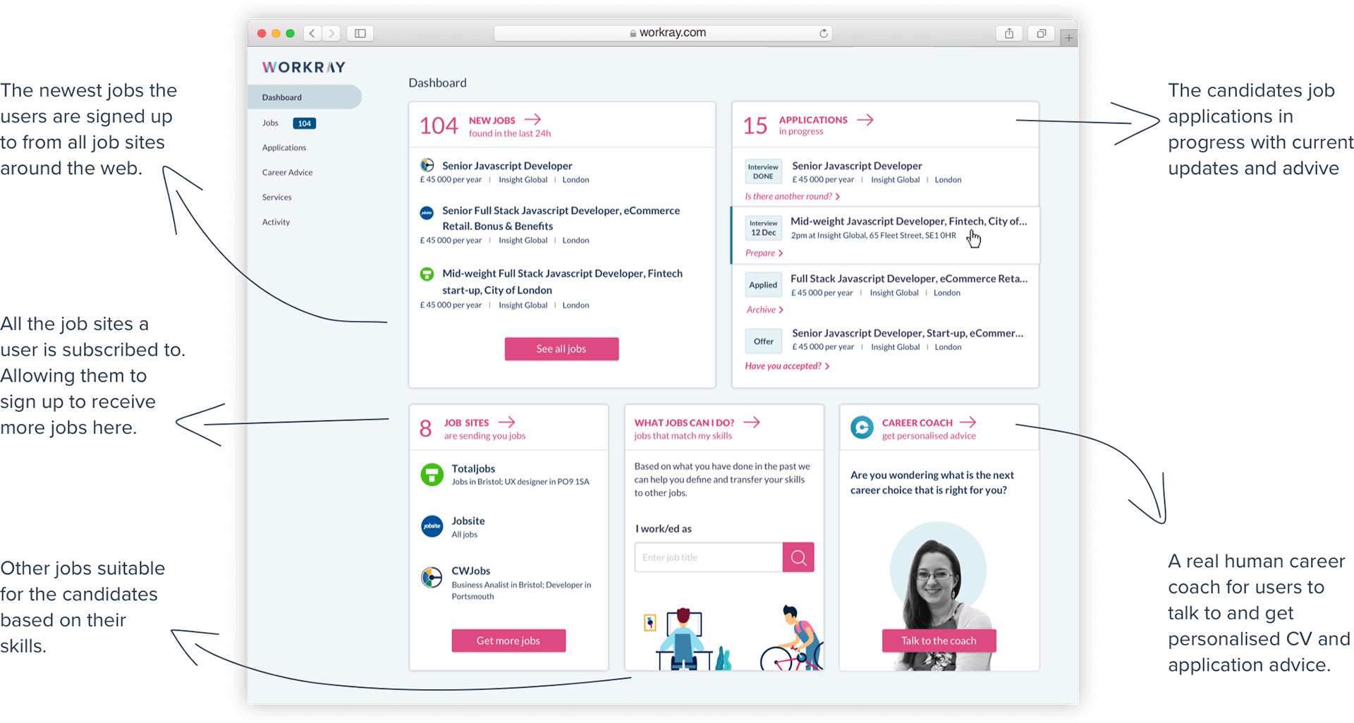
As part of the redesign I made sure the new dashboard was engaging for new users as well as returning users. New users were prompted to interact with the dashboard to help us enrich it with relevant job related content for the candidates.
NEW DASHBOARD - NEW USERS

The visual design of the old dashboard was also not favoured by users:
"...too dark and heavy, too blocky, information not as clear"
"It seems outdated, the colours are not modern, very outdated."
Colours
As part of the redesign of the dashboard and homepage of the Workray platform I looked at modernising the brand. The Development and Test teams were not keen on drastically changing the brand due to their already sizeable workloads. The font was not to be changed. We agreed to look at the colour palette - keeping some of the existing primary colours.
EXISTING BRAND COLOURS

I proposed seven design directions for the new uplifted brand colours to the team. After some discussions and voting we decided to go with Version A because it was closest to the existing brand and it was easier and faster to implement the changes on all pages of the platform.
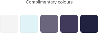
PROPOSED PRIMARY BRAND COLOURS
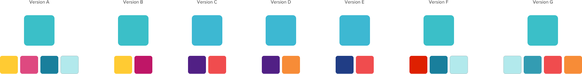
More details on how these colours impacted the homepage look and feel can be found below

Results
After we launched the redesigned dashboard we saw a huge uplift in click-through rates, engagement and time on page in the first month. Users now used the dashboard as intended and navigated to other areas of the site from there.
CLICK - THROUGH RATES
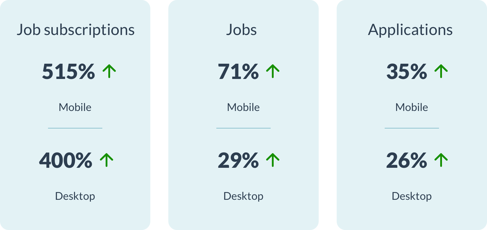
All metrics improved significantly, except one click-through rate (CTR). The links to individual job adds on mobile had gone down alarmingly by 33%. After looking at the implemented job links on mobile I realised the job titles were not developed as per the designs and they were too small for the users to read. As a result the developers aligned the job titles to the designs which boosted the CTR of the jobs themselves. The Dashboards bounce rate decreased as well.

When we asked users what they thought of the new dashboard they were really positive:
"I like the tables that everything comes in. Makes it easy to read and the bullet point format of the list makes it easy to follow. I do like it. Gives you a really good snapshot of what you’ve applied for ... where you are up to, what you need to do next ... how many new jobs there are, what job boards you are working through"
"One of the better ones I’ve seen in terms of presenting the information and giving you more information in terms of what is currently available, what you are doing, how many applications you’ve made. In the past when I’ve been applying via online job sites I had to track myself the information doing it the old fashioned way on a spreadsheet ... having this tools available on this dashboard is really good and it is one of the best sites I’ve seen for that”
However users didn't like the primary pink colour we kept from the old brand and is something we will be changing with the next iteration.
“I am not sure I like the pink ... it makes it look a bit cheap. I would .. do black ... or different shades of blue... it makes it look a bit funky.”
Award
The Workray platform was awarded "Best Newcomer" at the National Online Recruitment Awards (NORA) in 2018.