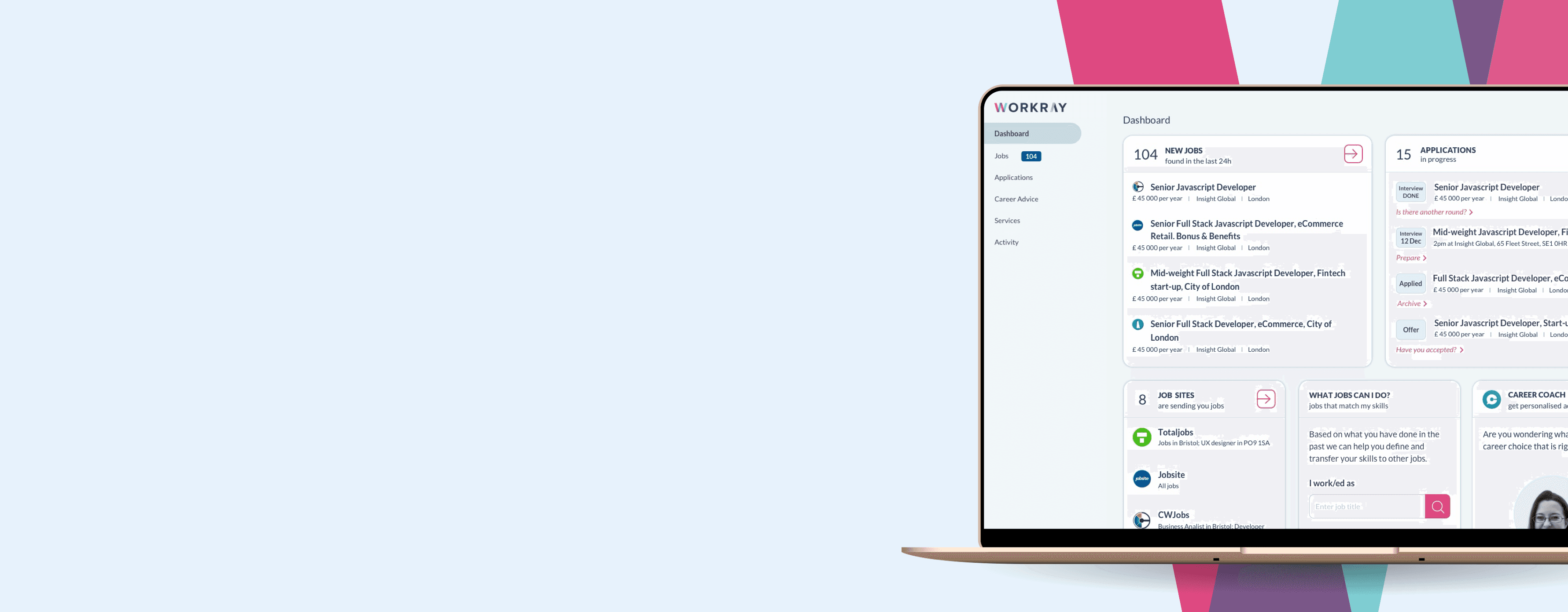
Dashboard showing a list of new jobs, applications and career coach option. light blue colours

515

%

click through rate boost

Dashboard showing a list of new jobs, applications and career coach option. light blue colours

515

%

click through rate boost

What is Workray?

What is Workray?

Workray is a platform designed to remove the friction from job hunting, allowing users to apply to 62 job sites from one place, simplifying the search and application management process.

Workray is a platform designed to remove the friction from job hunting, allowing users to apply to 62 job sites from one place, simplifying the search and application management process.

5 team members receiving an award. 4 male and Denni in the middle wearing a coral coloured shirt

My role

  • Redesigned the entire platform across both logged-in and logged-out experiences, including new design directions and a brand uplift (with updated illustrations).

  • Conducted the user research (moderated & unmoderated user testing, A/B testing).

  • Helped define the Mission & Vision of Workray.

  • Worked with the team to develop the content.

Driving sign-ups

Driving sign-ups

I begun by reworking Workray's value preposition to improve clarity around the value of creating an account. The new direction focused on building trust and making the service feel more inviting and useful.

I begun by reworking Workray's value preposition to improve clarity around the value of creating an account. The new direction focused on building trust and making the service feel more inviting and useful.

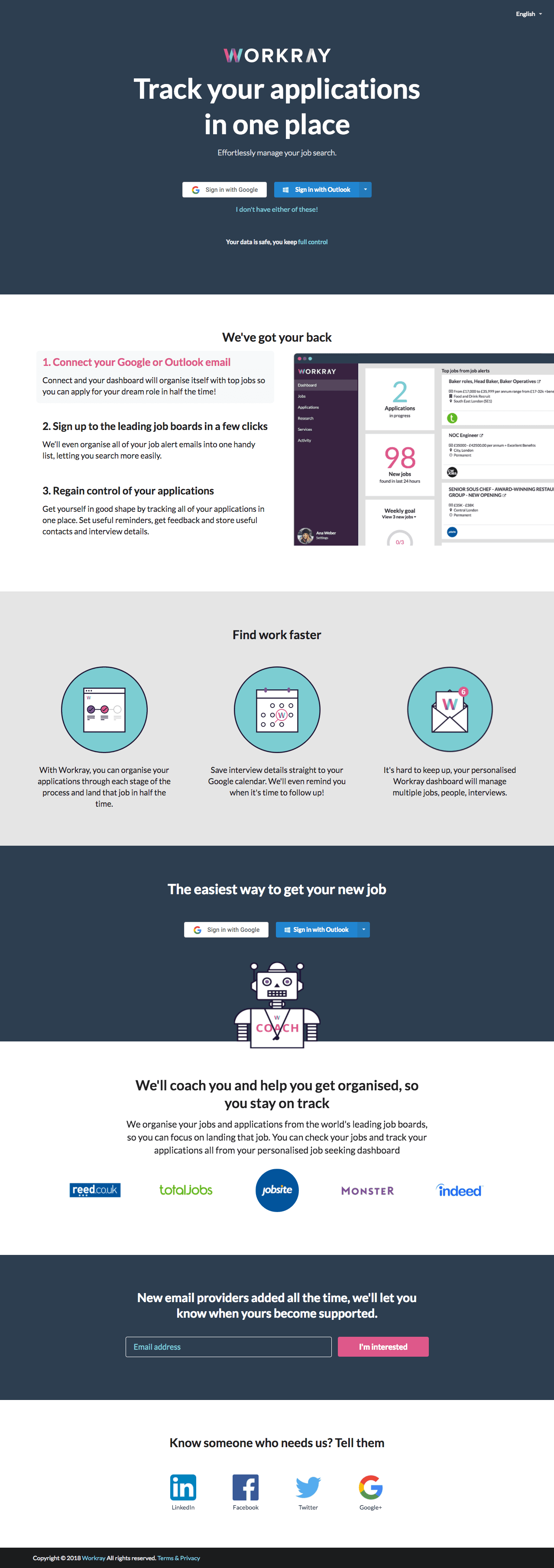
BEFORE REDESIGN

The landing page of workray before the redesign in very dark monotone colours

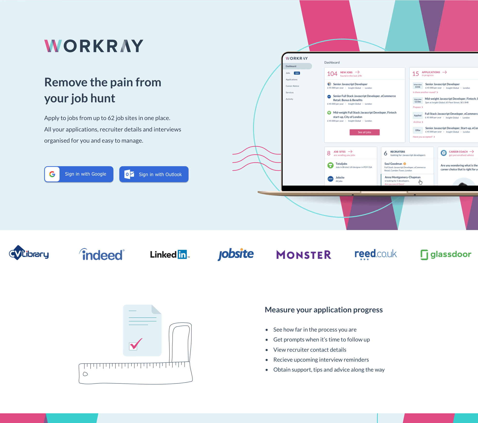
AFTER REDESIGN

The landing page of workray before the redesign in very dark monotone colours

Improved results

Improved results

54

54

%

%

Engagement increase

Time on page increased by almost a minute.

Time on page increased by almost a minute.

179

179

%

%

New registrations

We saw a huge uplift in new registered users.

7

7

%

%

Conversion

We saw an uplift in repeat returning users thanks to the increase in registrations.
Registration vs conversion

Registration vs conversion

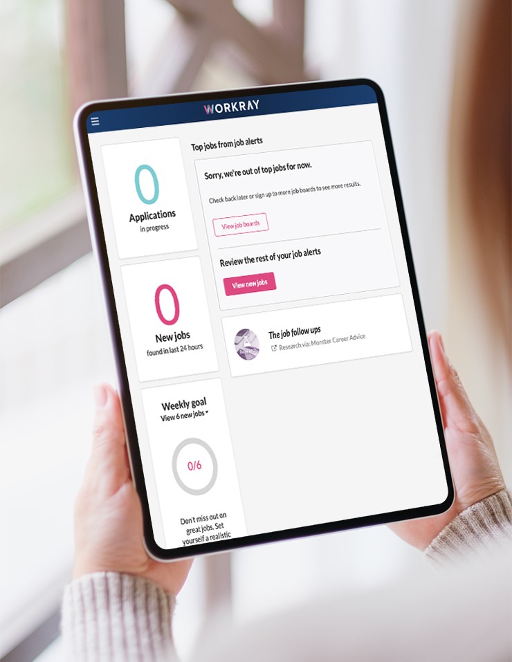
While the homepage was driving strong registration numbers, there was a clear gap when it came to conversion. After signing up, candidates were taken directly to the dashboard, where many failed to take the next step in their journey and most did not make a repeat visit.

While the homepage was driving strong registration numbers, there was a clear gap when it came to conversion. After signing up, candidates were taken directly to the dashboard, where many failed to take the next step in their journey and most did not make a repeat visit.

5 team members receiving an award. 4 male and Denni in the middle wearing a coral coloured shirt

OLD DASHBOARD

Dashboard issues

Once users reached the dashboard, the experience fell short. Many felt they had put in effort without getting value, leading to high bounce rates. Returning users also bypassed the dashboard entirely, making it clear it needed a rethink.

"

I just wasted my time. Gave you all this information and then I end up on a page that has a lot of zero things. Zero applications, zero jobs, zero goals."

"

There is nothing useful on this page to help me get a job"

Platform redesign

Platform redesign

We started with a dashboard redesign, which later evolved into a full platform overhaul.

We started with a dashboard redesign, which later evolved into a full platform overhaul.

CANDIDATE GOAL

I want to track my job applications and stay organised so I can improve my chances of getting a job.

BUSINESS GOAL

Retain new users by increase time on page, click-through rate and engagement on the dashboard.

Limitations

Limitations

With limited back-end capacity, a full redesign wasn’t immediately feasible. To maintain momentum, we focused on front-end improvements—leveraging existing functionality to quickly deliver value to users while working within technical constraints.

With limited back-end capacity, a full redesign wasn’t immediately feasible. To maintain momentum, we focused on front-end improvements—leveraging existing functionality to quickly deliver value to users while working within technical constraints.

Returning user

Returning user

The new dashboard in bright, light colours

New user

New user

The new dashboard in bright, light colours

As part of the redesign, I focused on making the dashboard valuable for both new and returning users. By encouraging new user engagement, we were able to enrich the experience with more relevant content.

1

Digest of the newest jobs users are signed up to across the web.

2

All job applications with current updates and advice.

3

Job sites the users has an account with appear here.

4

Helping users see jobs they may not have considered, based on their skills.

5

Access to a real career coach for personalised CV and application support.

1

1

Digest of the newest jobs users are signed up to across the web.

2

2

All job applications with current updates and advice.

3

3

Job sites the users has an account with appear here.

4

Helping users see jobs they may not have considered, based on their skills.

5

5

Access to a real career coach for personalised CV and application support.

As part of the redesign, I focused on making the dashboard valuable for both new and returning users. By encouraging new user engagement, we were able to enrich the experience with more relevant content.

Click-through rates uplift

Click-through rates uplift

We saw uplift in click-through rates, engagement and time on page in the first month. Users now used the dashboard as intended and navigated to other areas of the site from there.

We saw uplift in click-through rates, engagement and time on page in the first month. Users now used the dashboard as intended and navigated to other areas of the site from there.

Job subscriptions

515

515

515

%

%

Mobile click-through rate

Mobile CTR

400

400

400

%

%

Desktop CTR

Job listings

33

33

33

%

%

*

*

*

Mobile CTR

29

29

29

%

%

Desktop CTR

Applications

35

35

35

%

%

Mobile CTR

26

26

26

%

%

Desktop CTR

*Data driven bug discovery

*Data driven bug discovery

All key metrics improved significantly, except the job listing click-through rates on mobile which decreased by 33%.

All key metrics improved significantly, except the job listing click-through rates on mobile which decreased by 33%.

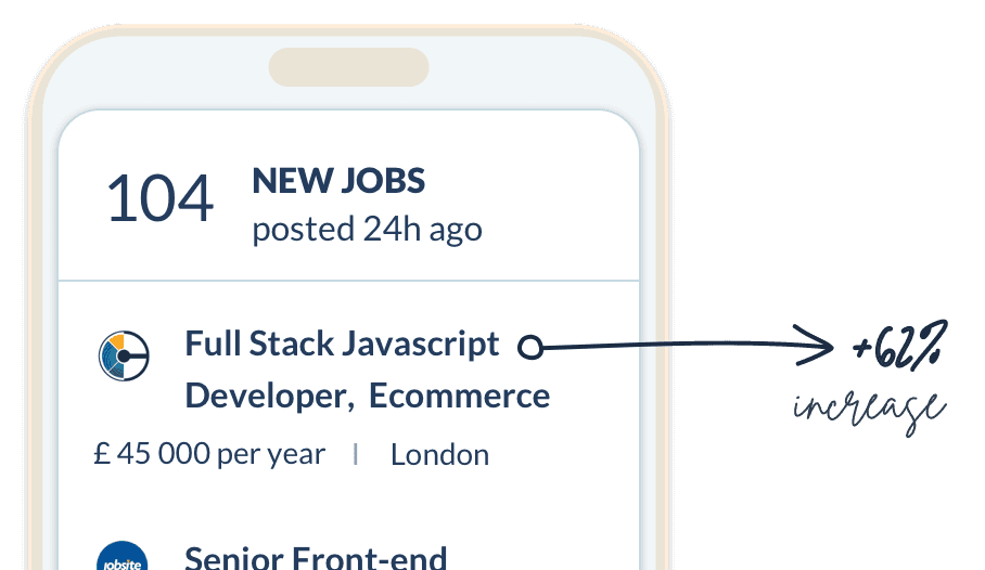
Image of a mobile with listed jobs and an arrow pointing out from the font of the job title

On closer investigation, I discovered that on certain mobile devices, job links were not rendering as intended and appeared too small to read. Once this was addressed and aligned with the original designs, job CTR increased, and the dashboard bounce rate decreased as a result.

Post launch user testing

Post launch user testing

When we asked users what they thought of the new dashboard they were really positive.

When we asked users what they thought of the new dashboard they were really positive.

"

One of the better ones I’ve seen in terms of presenting the information and giving you more information in terms of what is currently available, what you are doing, how many applications you’ve made. In the past when I’ve been applying via online job sites I had to track myself the information doing it the old fashioned way on a spreadsheet ... having this tools available on this dashboard is really good and it is one of the best sites I’ve seen for that”

"

I like the tables that everything comes in. Makes it easy to read and the bullet point format of the list makes it easy to follow. I do like it. Gives you a really good snapshot of what you’ve applied for ... where you are up to, what you need to do next ... how many new jobs there are, what job boards you are working through"

Awards

Awards

"Best Newcomer" at the National Online Recruitment Awards & employee of the month at Stepstone for "Consistently delivering great designs for all teams that convert".

"Best Newcomer" at the National Online Recruitment Awards & employee of the month at Stepstone for "Consistently delivering great designs for all teams that convert".

notepad - feltip fen writing 42% conversion
Studio image of Denni wearing a yellow blouse on a teal backdrop

To help you increase click-through rates

To help you increase click-through rates

Feel free to contact me to discuss possible permanent & contract opportunities at deni.red@gmail.com and LinkedIn.

Feel free to contact me to discuss possible permanent & contract opportunities at deni.red@gmail.com and LinkedIn.

Designing for an
AI-first world

Reimagining existing platforms as AI-first experiences, helping users make better decisions.

Designing for an AI-first world

Reimagining existing platforms as AI-first experiences, helping users make better decisions.

Engagement growth

40

40

%

%

A digital transformation and redesign that achieved higher event attendance.

Conversion success

42

42

%

%

An experiment that grew into a standalone product across two countries.

PROCESS

Fostering accessible design

Fostering accessible design

Helping product teams bring accessibility into their design process from the very start.

Helping product teams bring accessibility into their design process from the very start.

lab attendant using tring to tie their shoelaces with the Cambridge simulation gloves - creating physical resistance and limit mobility, dexterity, and grip strength

All rights reserved @Denni Bakardji. Design and build by @Denni Bakardji