Removes the pain from job hunting
Workray lets people looking for work to apply for jobs from up to 62 job sites in one place, organises all their applications, recruiter details and interviews, making job hunting easy to manage.
Challenge
Workray is an online platform that can be accessed only when users are logged in. Therefore, the homepage has to explain the benefits of signing up and using the platform before users commit to an account; It has to be trustworthy for users to relate to it.
Problem
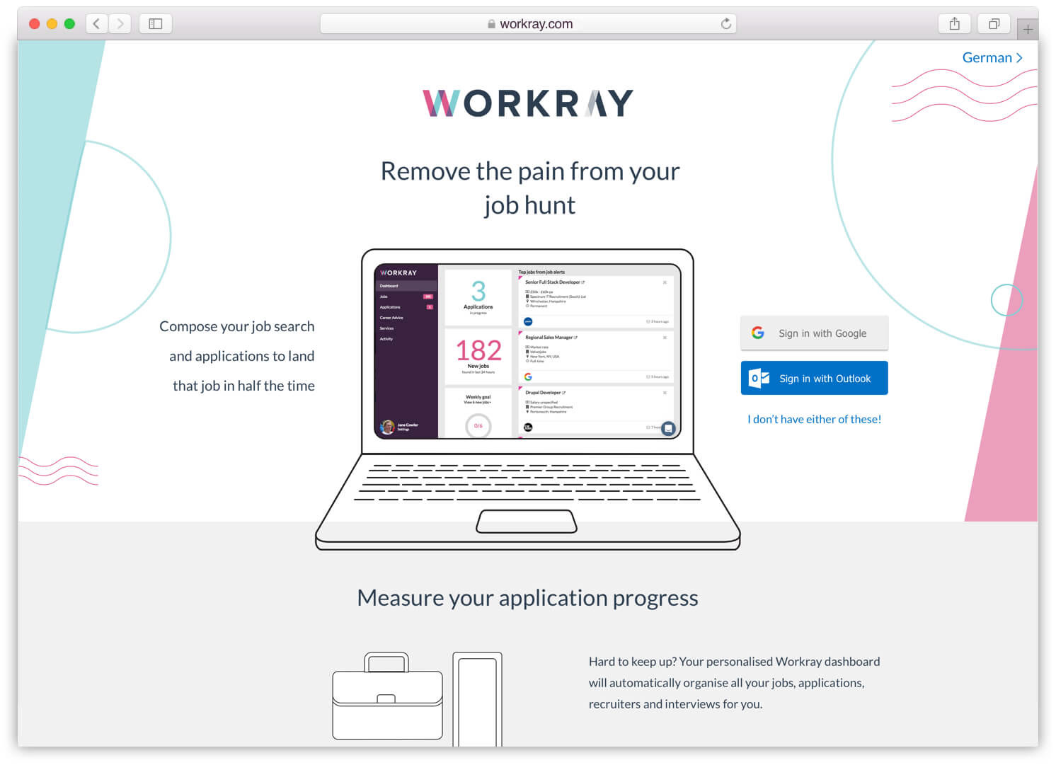
Users were not sure what Workray's service were, what problem it was trying to solve for them, and described it as outdated, dull and not inviting.
Existing website
My Role
I conducted remote user testing of the homepage to understand user pain points over the period of two months; I worked alongside the Head of UX & Product and a Designer to define the Mission & Vision of Workray. We developed the content and copy to explain the benefits of creating an account for users. I created six new design directions for the homepage inline with design trends; A/B tested the new designs and copy vs the live site.
The Process
Early insights
We had a lot of insight from users that had engaged with the Workray chat on the homepage. When users didn't fully understand the service they turned to the live chat for answers.
High level goals
1. User goals: Answer most common user questions in the preposition; Explain the service.
2. Business goal: Increase sign ups.
I worked alongside the Head of UX & Product and a Designer to define the Mission & Vision of Workray based on user feedback and insights from the Workray chat.
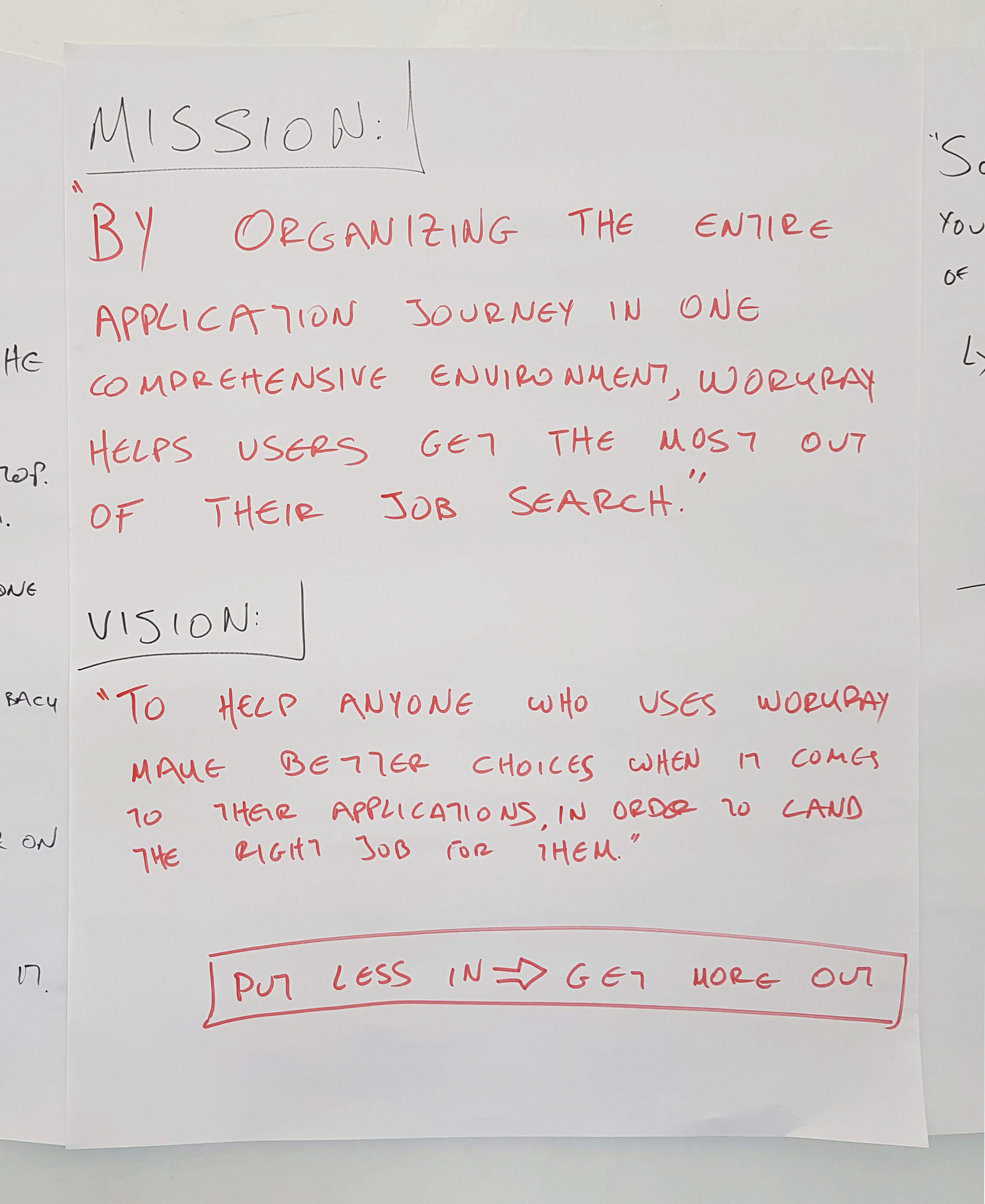
This helped us put together the first draft of the content for the page.
Design direction
I then designed six new variations of the homepage with slightly different copy.
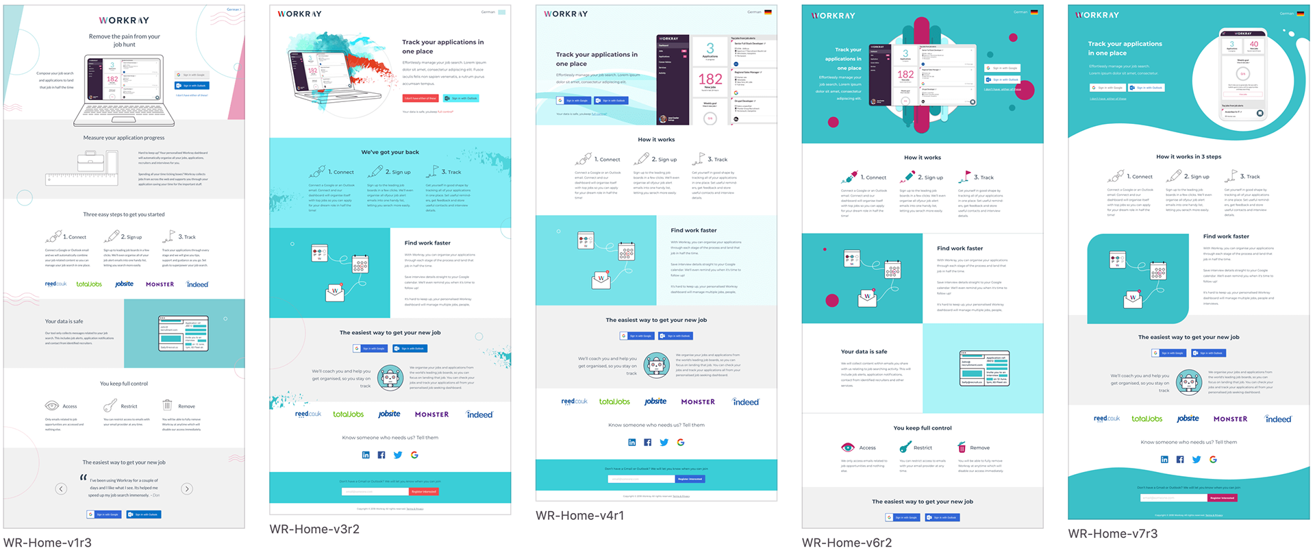
We put the designs in front of the wider team to see which version they prefered. The majority of our team members went for the first version.
User testing
A/B testing - Qual & Quant
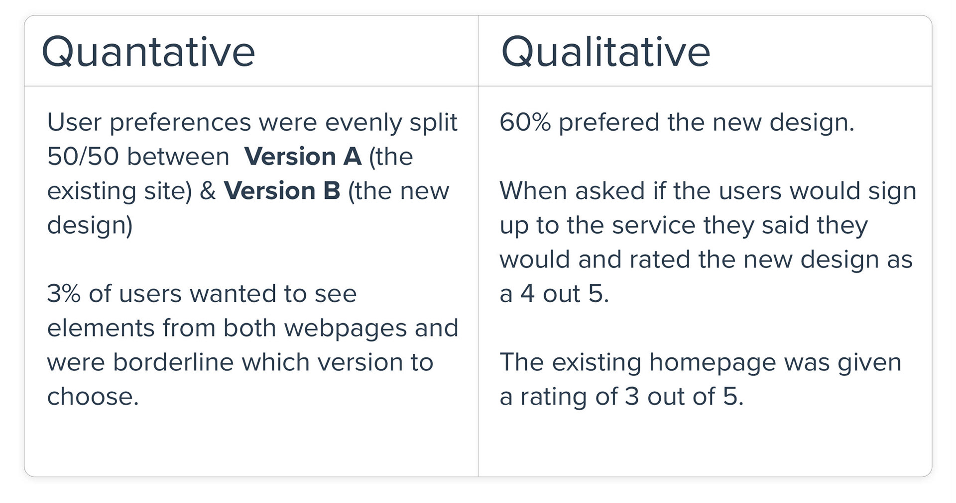
I then A/B tested the new design against the existing homepage. I did qualitative research through remote user interviews and quantitative research based on user interactions and an online survey.
The results were inconclusive at the beginning but there was enough data to go back to the drawing board.
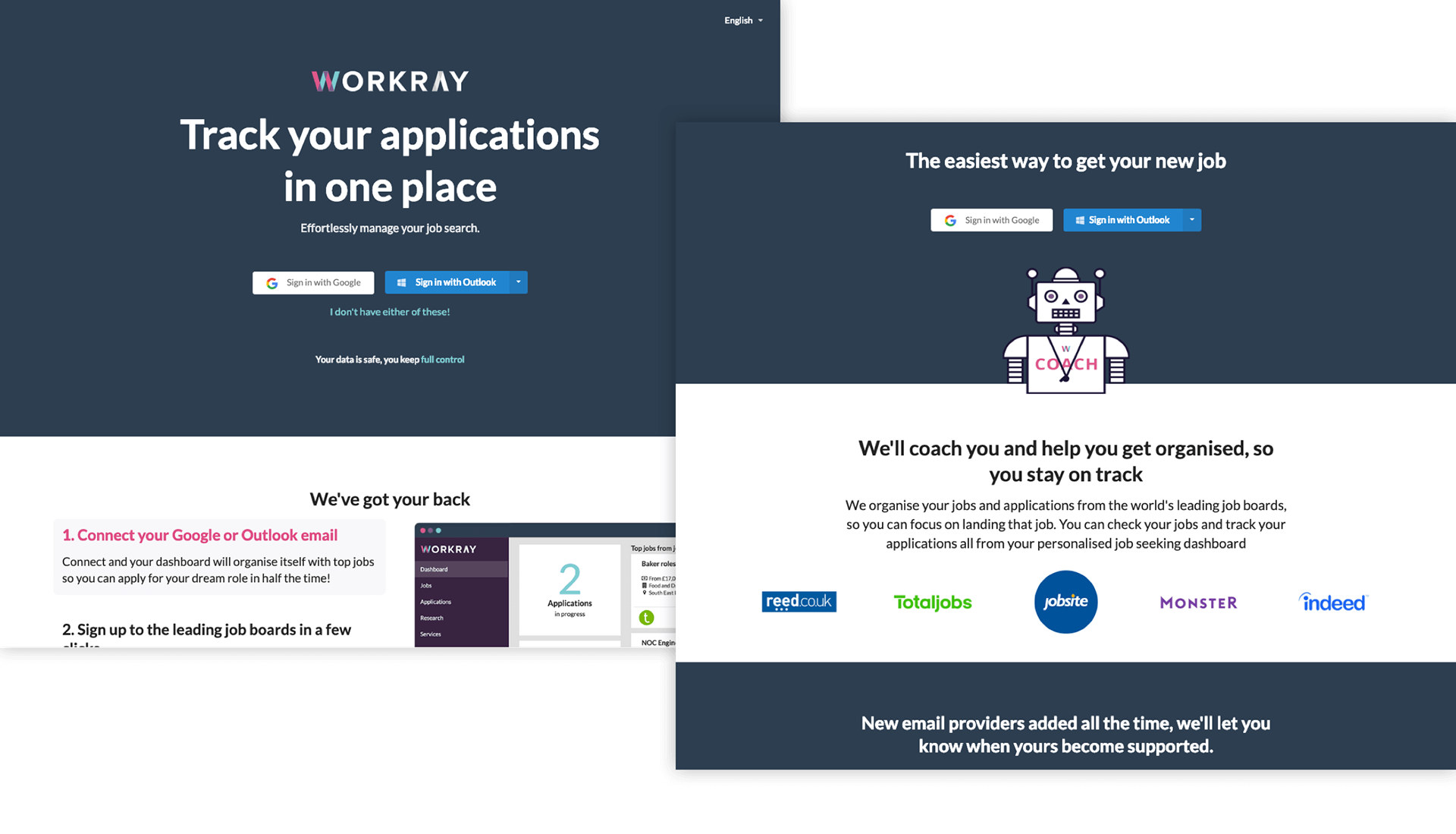
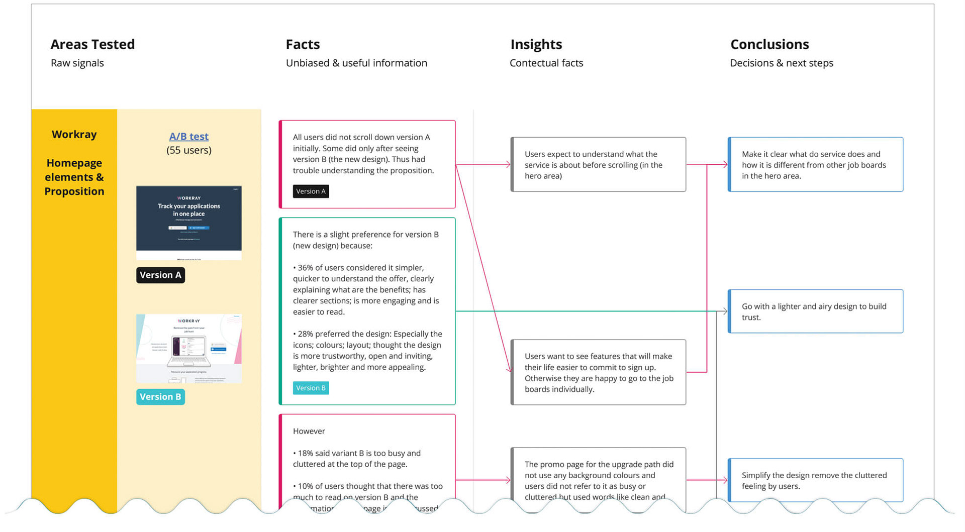
"This page says "Track your applications in one place" at the top, which highlights that the website will help provide an easier application process by having all applications in one place. This page also makes it more clear that Google and Outlook mail can be connected for this website." - User commenting on the existing homepage
When users prefered the new design it was because:
• It gave more information around sign up;
• The process of how it works was defined;
• It felt more trustworthy and safer to provide their personal details;
• It looked more professional;
• There was confidence from other users- testimonials;
• The icons were clearer;
• It was more visually appealing, the layout was much better;
• There was a hero image;
• It was lighter, carefree, plainer.
Unmoderated user interviews
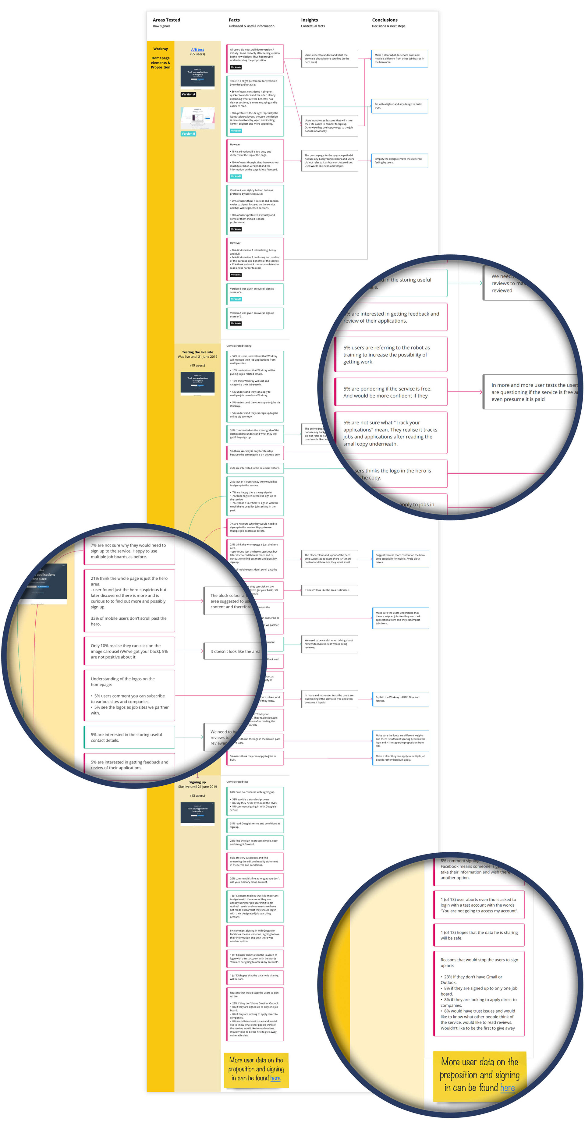
In the meantime I continued to user test the live site over the period of 2 months with 30 users to better understand their pain points. At some point it was getting difficult to search through the multiple test reports. A categorisation was needed to be able to support concrete evidence and discover user patterns more effectively.
Atomic UX research
I started logging the high-level findings of the user tests in one place to be able to refer to them and find the insights more readily .
The document is still being used to log in all user test insights on the new live homepage. This helps us track why we have improved each section and gives product direction on what to improve next.
Copy
The atomic UX research helped focus on the current user pain points when on the homepage. The copy was rewritten once more based on the mission, vision, our high level goals and user insights.
Website
The first version of the design had to be improved based on the feedback from the A/B testing, taking on board the negative comments it received from users.
" I would be interested to know more about that and see how that works... That is pretty similar to what I have at the moment from the other sites I am signed up for"
"I actually only dismissed it because I disliked the colour scheme and thought it was too pale and did not stand out enough, but the information on it, was very good."
Users disliked the dark colours of the existing website, finding them intimidating, heavy, blocky and dull but did not like the new version because it was too pale.
This meant an improved version of the new design was needed - Something light but with a bit of a kick.
This meant an improved version of the new design was needed - Something light but with a bit of a kick.
What went live
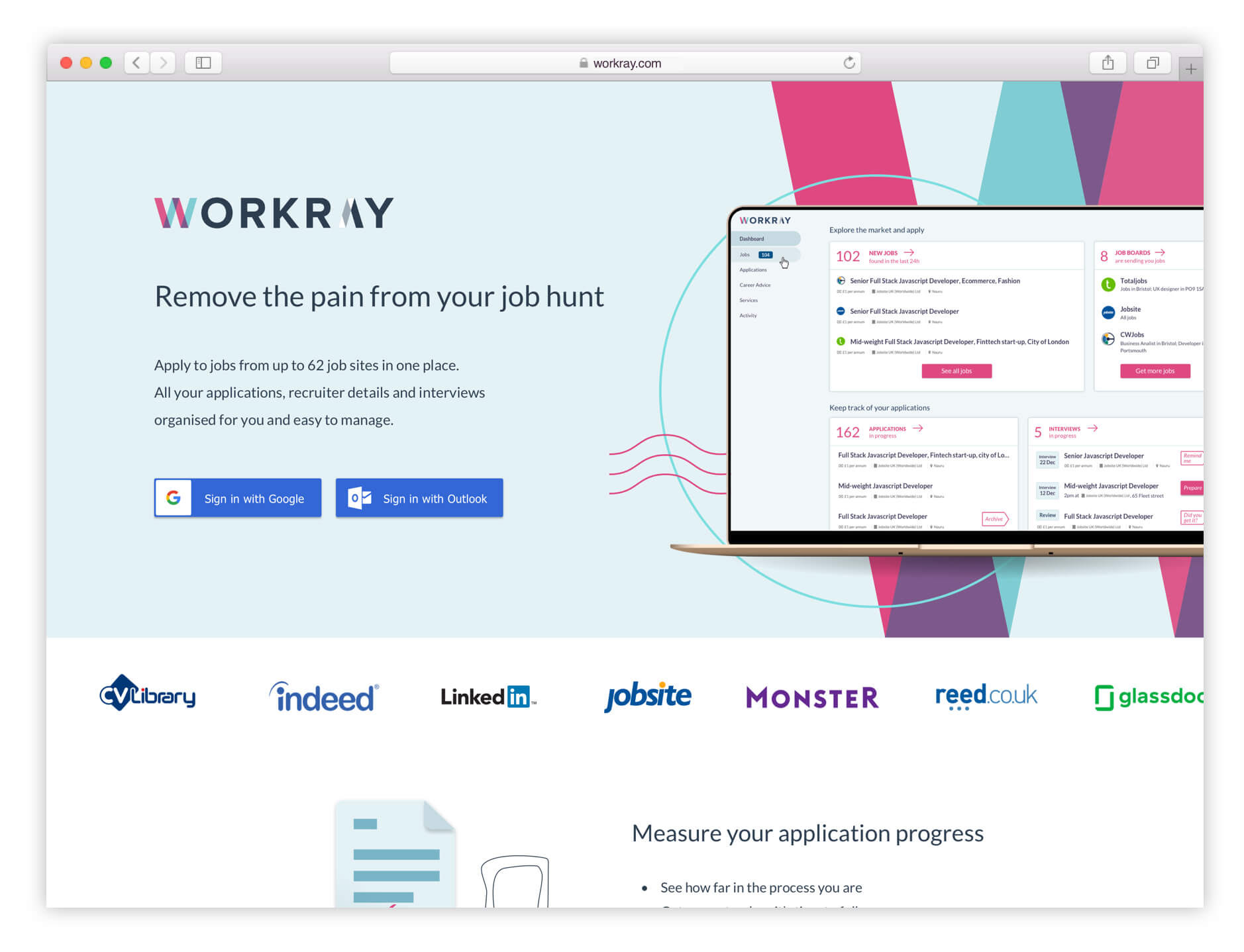
The new homepage is now live can be found here https://workray.com
More details on the visual designs can be found below..

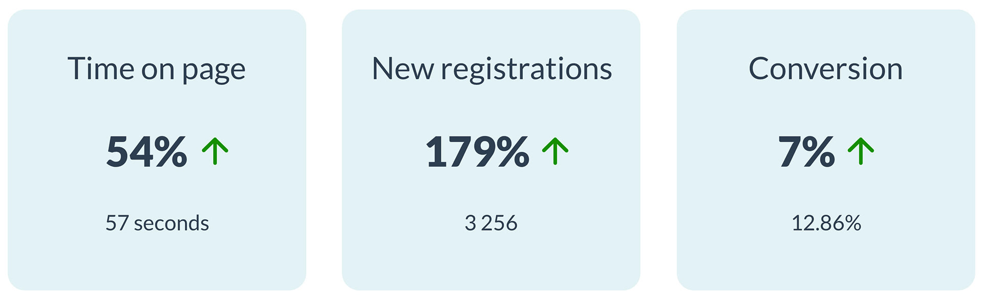
Results
We compared the results from the first two weeks after launching the redesigned homepage against the two weeks prior to launch and could see huge improvements.
YET to be done
We are now monitoring the new homepage and conducting user testing which is being added to the Atomic Research with next steps and improvements.
Watch this space!