TRUPHONE.COM EVOLUTION
CHALLENGE
Old website provided negative experience of Truphone:
No personas were targeted; Mobile operator yet no mobile optimised site; Unsecure HTTP SSL caused mistrust and reluctance to submit personal details; Unclear navigation; Competing calls to action; Link colours used on non-interactive elements; No layout grid; Inconsistent design elements; Site made Truphone look amateur.
Aim
Scope
Given the project’s size (1300 live pages couldn’t be migrated in one go), a phased approach was ruled most realistic. Our aim was to refresh basic content and design of top-level business pages. These would act as the building blocks for future content and design components, with user testing and analytics to guide our next steps.
Executive Direction
Focus on business users and the concept of enabling freedom. Talk about the Truphone difference and unique selling points.
My role
UX
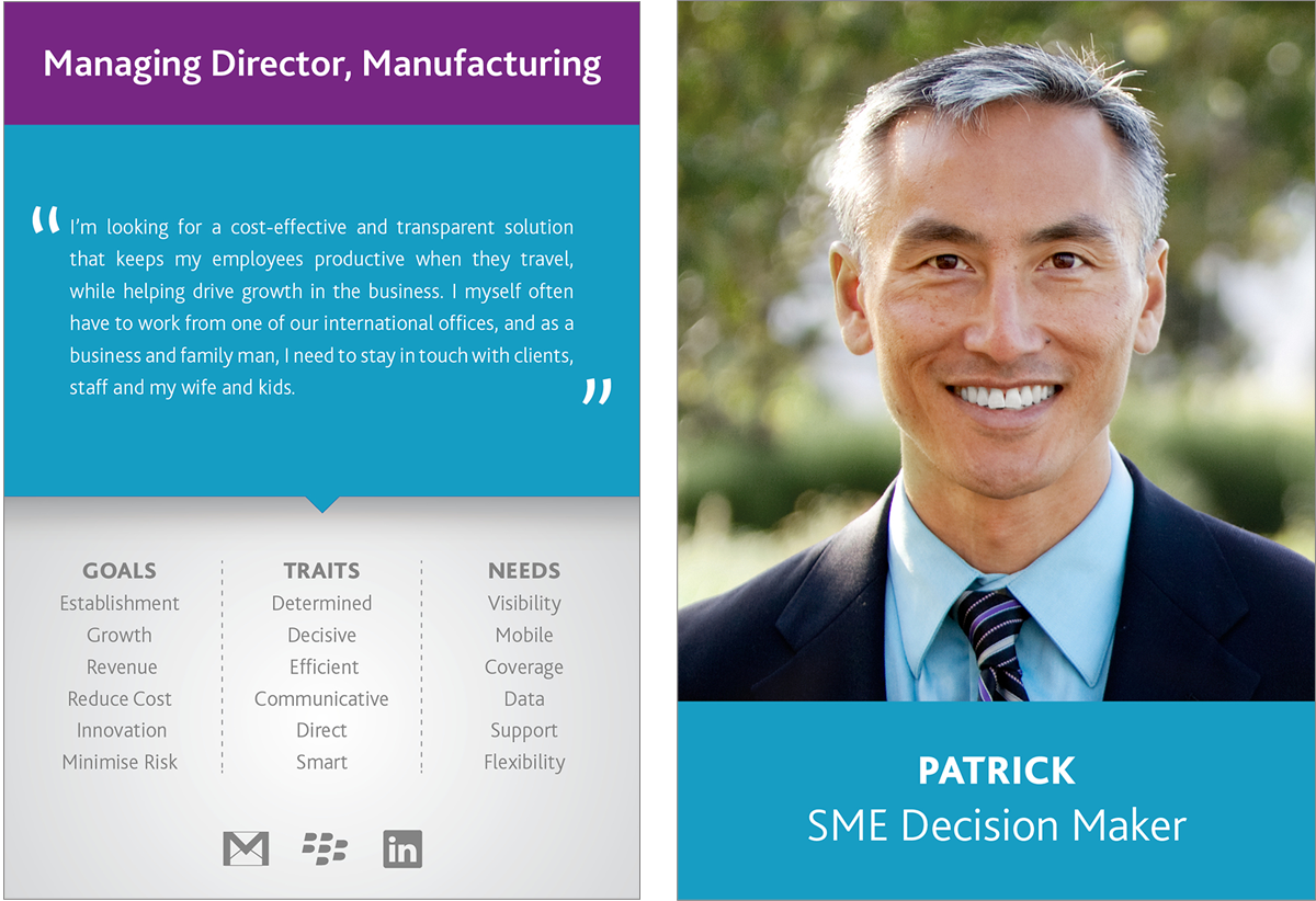
Created personas and opportunity statements based on stats from existing customers, interviews with customer-facing employees, feedback from stakeholder workshops, and data gleaned from qualified sales leads. Main personas now modelled on procurement professionals, CIOs and managing directors.
Image: Primary Personas
Image: Primary Personas

Identified missing content and areas of improvement with help of user testing and internal workshops. Produced extensive workshop reports for the executive team. Created workshops which were extremely difficult to run due to the fact that Truphone's offices were spread across four continents. Produced user journeys and developed full information architecture. Launched with top-level pages as per phased approach.
Image: WORKSHOP to Identify content gaps. RESULT - business agreed on what areas we need to develop. Organised missing content by data clusters

Image: CARD SORT WORKSHOP to group content areas. RESULT - business agreed on the information architecture of the site.
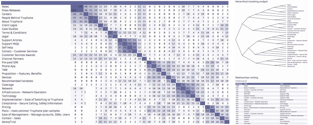
Image: Full Information Architecture
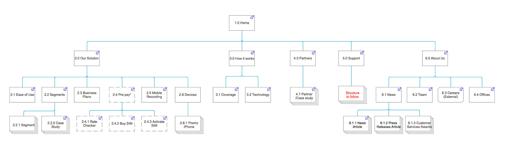
Image: MVP Information Architecture
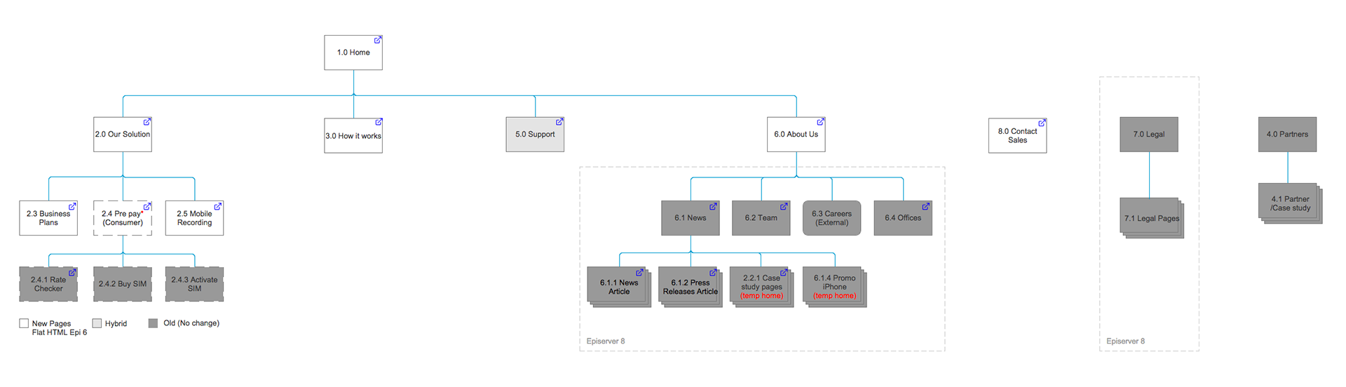
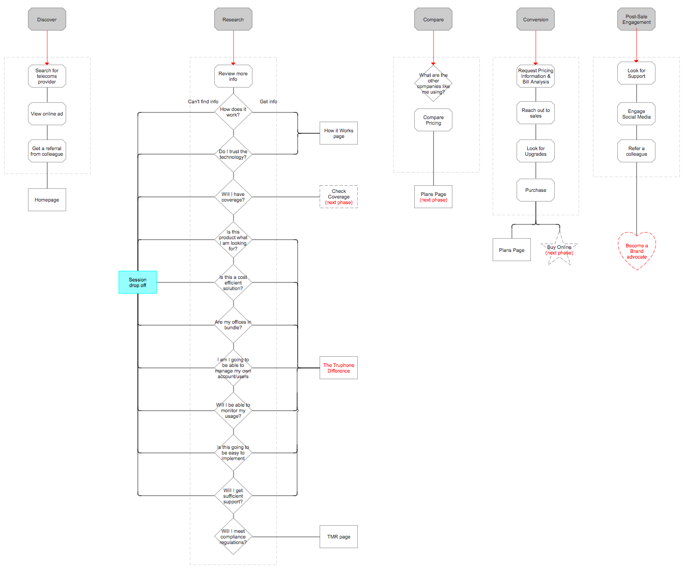
Image: User Journeys

Wireframe: myo5iw.axshare.com
Password: donotdetract
Password: donotdetract
Results
Thanks to the workshops all stakeholders in the business were involved in identifying and defining the areas of the site that need to be developed. Stakeholders were now aligned in the Truphone.com evolution and they helped shape the new information architecture of the site.
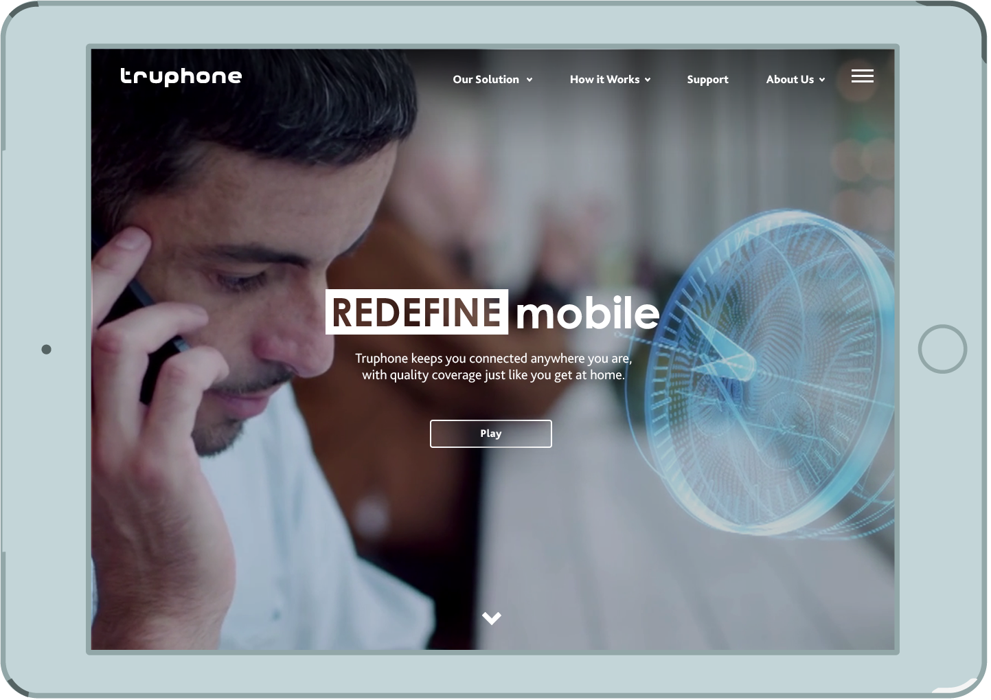
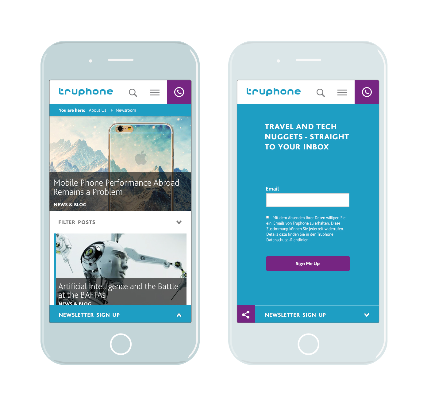
Design
To avoid confusing our users, new pages couldn’t look too alien from old pages. Therefore, my designs retained visual elements of old site, while providing a new responsive experience influenced by current design trends. Existing brand guidelines were followed in the process.New Responsive Site